Create Pivot Table And Pivot Chart In Excel Less Than Two Minutes
Pivot tables are a powerful way of seeing your data, grouped according to the data in the columns in your spreadsheet. Pivot tables offer you some of the benefits of databases without all the complexity. Pivot charts are a similar feature that allow you to visually see the data broken down in the same way.
Pivot Tables
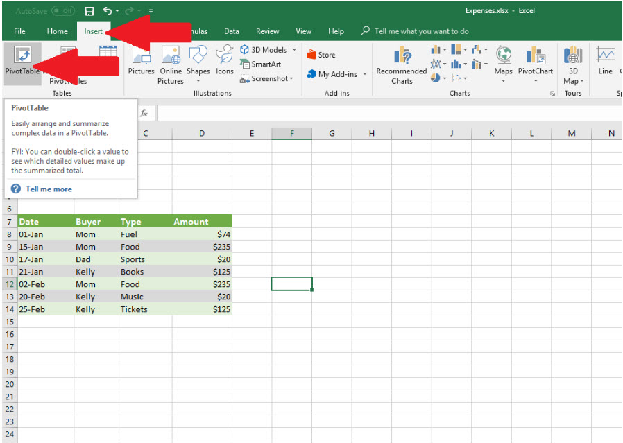
First, let's start with some simple data. Here is a list of expenses. In Excel 2016, you create a pivot tables by clicking the Insert tab and then clicking on the PivotTable button on the ribbon.
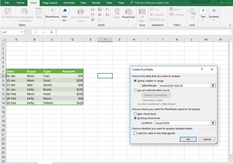
When you click the PivotTable button, the Create PivotTable dialog box appears. For this example, we make sure the "Select a table or range" radio button is selected. The cursor should be in the Table/Range field. At this point, we can highlight the data cells, including the headings. Once we select the cells, the cells are referred to in the field. The PivotTable itself will be placed at the cell you had highlighted when you clicked the PivotTable button. If you want it somewhere else, you can change this by wiping out the value in the Location field and clicking in a cell.
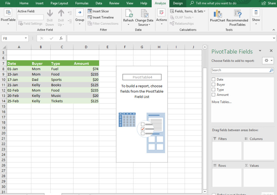
Once you click "OK" on the dialog box, the PivotTable Fields pane will be displayed on the right side of the window. You can see all the fields of the data that you added to the PivotTable. The names of this data correspond to the headings of the cells that we selected. There are four areas at the bottom of the panel: Filters, Columns, Rows and Values. These areas allow you to add the data fields exactly you want to see them.
Ticking the checkbox next to the field will add that field to the pivot table. Excel will automatically place a selected field into the area that it thinks is the best for that data. You can move a field from one area to another simply by dragging it from one box to another.
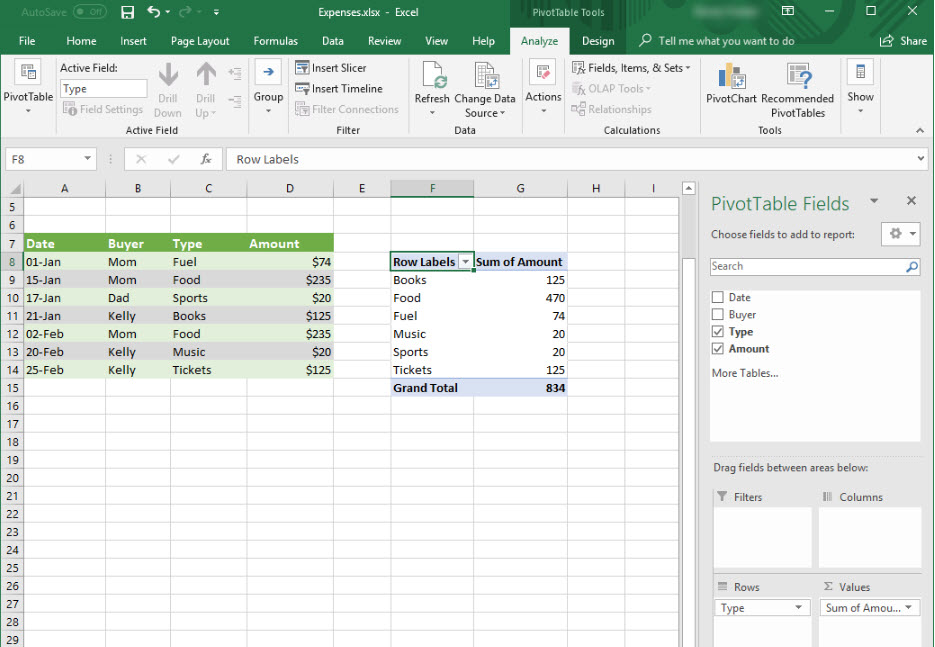
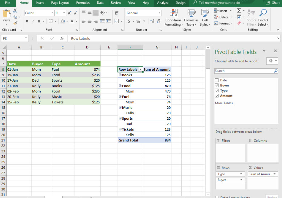
You can manipulate the way that pivot tables presents the data. For instance, you can check the box for the Buyer field and add the field as a row. This will cause the data to be grouped into types as before, but now subdivided by Buyer.
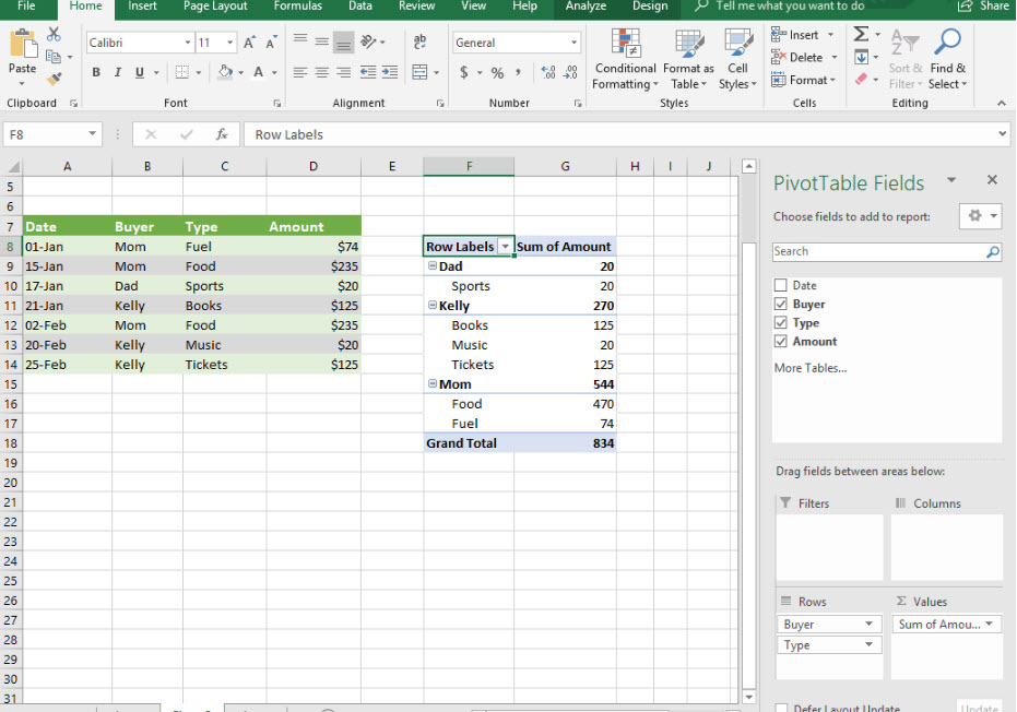
By dragging the Buyer field above the Type field inside the Rows area will cause the data to instead be divided into groups according to Buyer and then subdivided by Type.
Pivot Charts
Pivot charts allow you to take the powerful data representations that pivot tables make possible and turn it into a graphical form. They say "a picture is worth a thousand words," and that is definitely true with pivot charts.
To create a pivot chart, make sure that the Insert tab is selected and click on the PivotChart button on the ribbon.
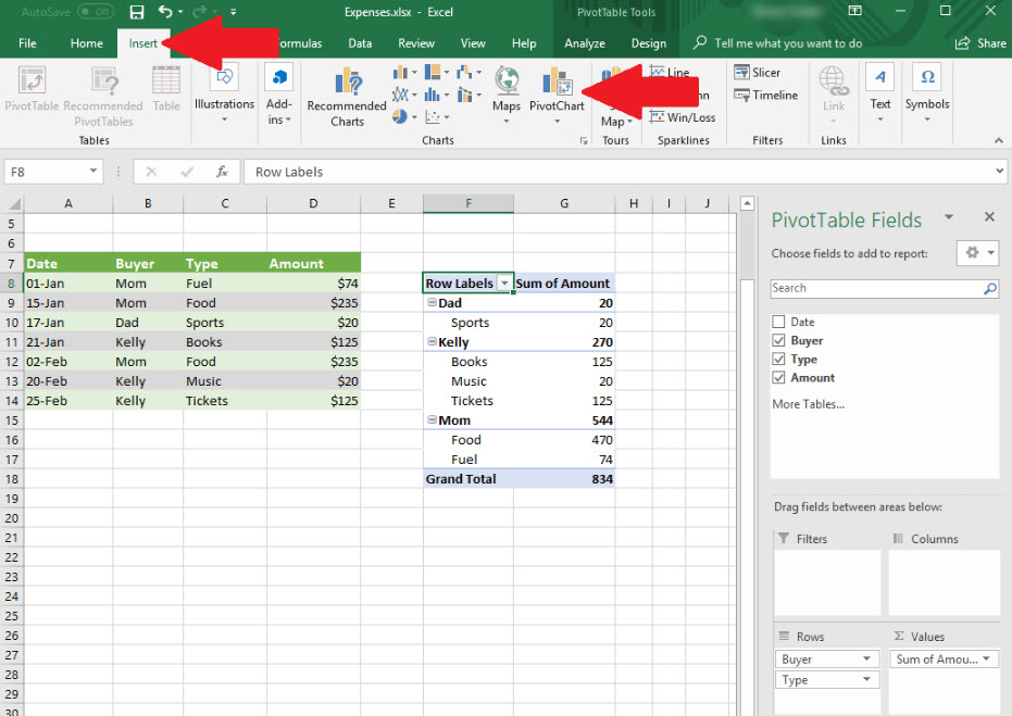
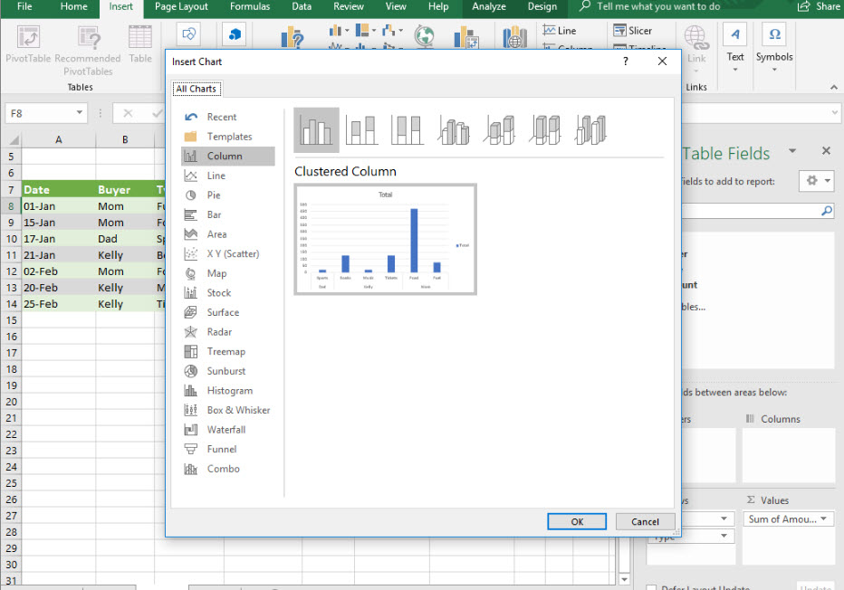
Doing this opens up the "Insert Chart" dialog box, which gives you many different options with regard to chart type.
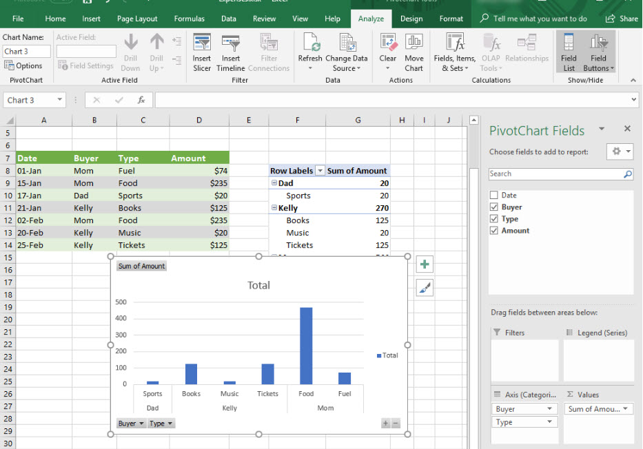
If we click OK and stick with the "Clustered Column" default, it looks like this. As you can see, the bars are grouped together by Buyer, just like the pivot chart upon which it is based.
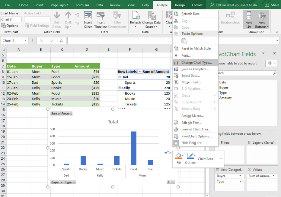
By right-clicking on a blank part of the chart (so as not to click on an actual chart element, which will enable you to manipulate those), a context menu will appear that will allow to change the chart type.
Choose the Pie Chart chart type from the dialog box that pops up.
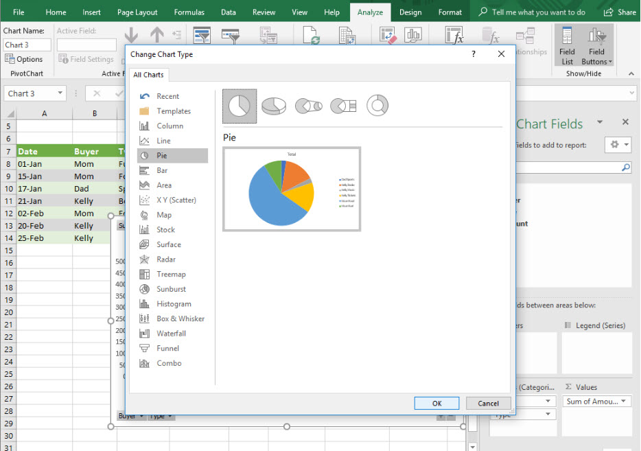
If you look at the chart that comes up with the pivot table we currently have, you will notice that the data doesn't make much sense. This is because it is looking at the entire table grouped by Buyer and the percentages of each Type within.
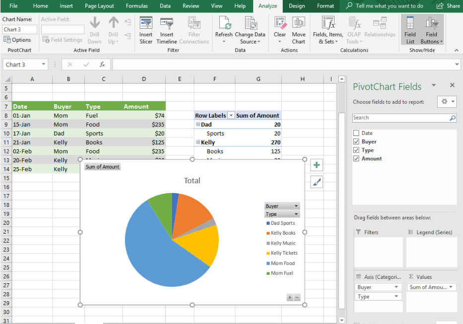
If you drag the Type field above the Buyer field in the Axis (categories) area, the pie graph will make a lot more sense. The amount spent on Mom for food constitutes 56% of the purchases in our table. In G27, we can see that 470 divided by 834 is in fact 0.56, matching the 56% figure.
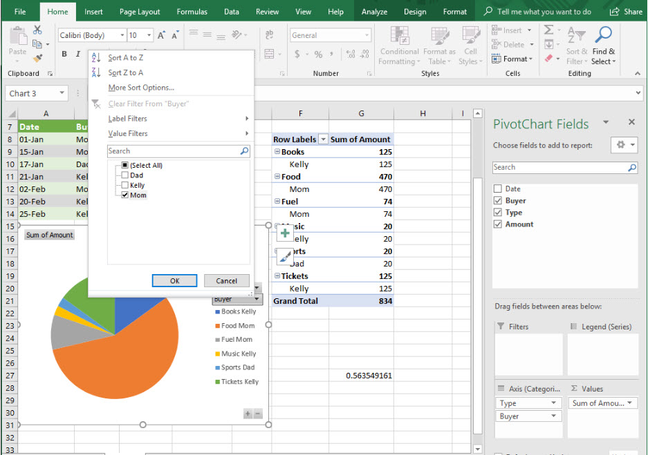
Pivot charts is incredibly flexible and dynamic. You can use the dropdowns inside the chart to filter the data. If we want to see Mom's purchases on a percentage basis, we can click on the Buyer dropdown and select Mom. This will filter only Mom's purchases and show them in the pie chart, showing the percentage of Mom's purchases for each Type.
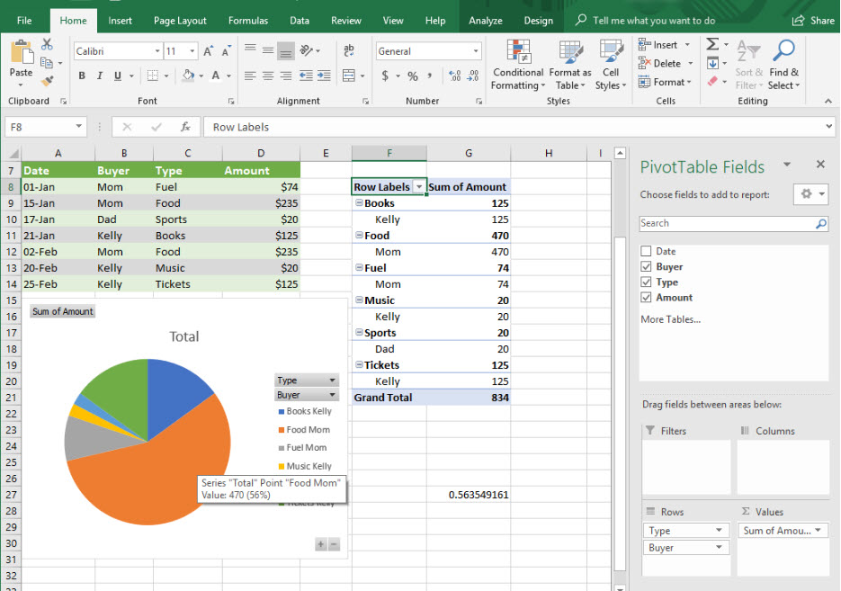
As you can see, pivot tables and pivot charts are very powerful and useful. The ability to change the data fields around to show precisely what you want in the way you want it is what gives the pivot table and pivot chart their names.
